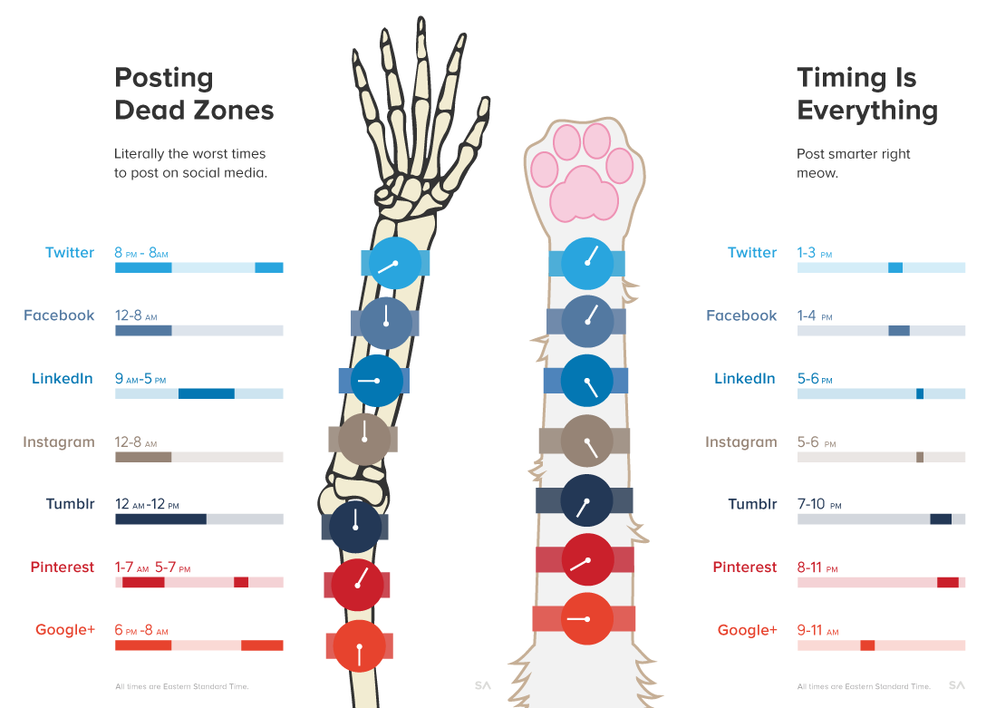
This is data-geekery, but sometimes I’ll run across diagrams with valuable information and they’re difficult to utilize because they’ve been designed to go viral, rather than with handiness in mind. This social media chart by @SumAll (sumall.com) is one of those. It has great information about the best and worst periods for posting content to a variety of social media channels. The problems are:
- The color-coding doesn’t communicate anything useful other than the brands.
- The time period numbers don’t align with the time they correspond to.
- The timeline doesn’t communicate relevant context like the typical workday or daytime to reveal which networks are for night owls (e.g.).
- The good and bad timelines are divorced, so you can’t see the “okay” periods.
- The watch artwork serves no purpose other than visual noise because there’s no a.m./p.m. distinction.
Don’t make Tufte cry.
Here’s the Before
Here’s the After
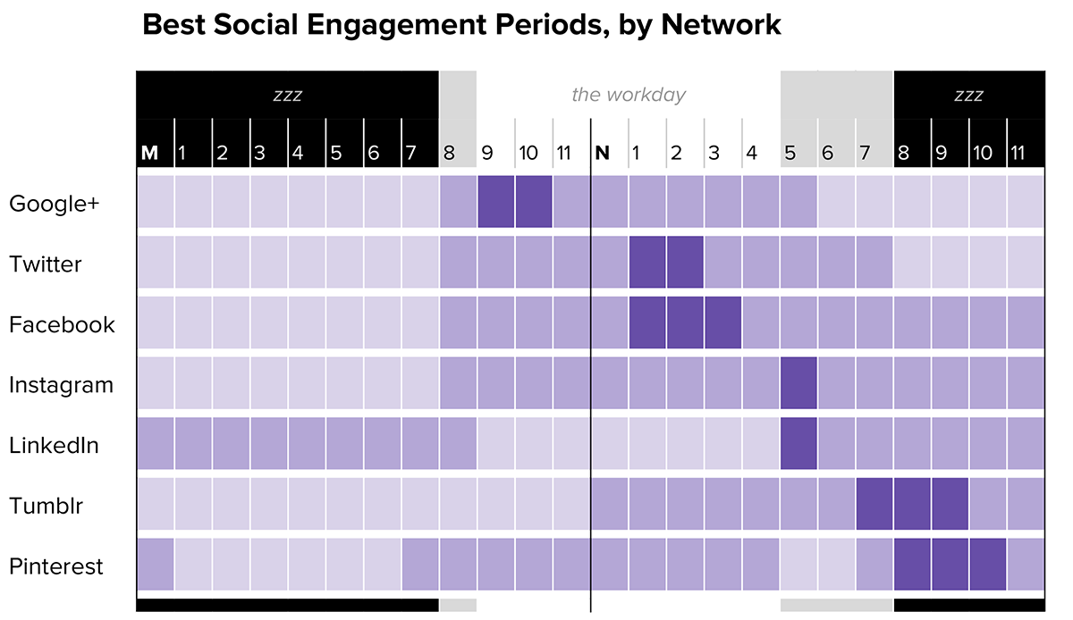
Now, sure. Their version may look more fun, with the cat and all. Mine is the one a social media person may print out and glance at though, without needing to mentally dissect the information through the cruft. What I focused on:
- Order the networks from earliest to latest peak engagement periods, to allow someone to work down the list through the day.
- Show highest and lowest periods, using tone more than color, to address color blindness concerns.
- Mark “M” for midnight and “N” for noon, to avoid the awkward military time.
- Show daylight hours and workday hours.
What would make it better? There’s always room for improvement:
- Brand icons next to the names would give it a quicker visual scan.
- I could add a color key, but I believe the meanings here are fairly apparent, so meh.