
Recently, a friend and I were pondering the common design problem of sizing logos to go into a series of business profile pages. This is a frequent issue, be it with any set of images, but particularly with logos because their aspect ratios vary so widely. A batch of photos, on the other hand, are typically all landscape or portrait—maintaining a 4:3 or 5:4 ratio.
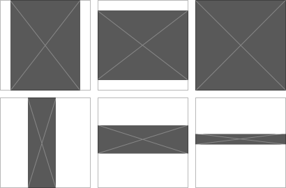
In this case, typical photos look just fine against a square boundary:

In the content management system (CMS) world, we often handle this issue of scale programmatically, by applying a maximum height and width to a particular module in a layout (as seen above). That works fine for photos because their ratio is somewhat close to a 1:1 square—they don’t look all that awkward slightly leaning into the rectangle format. However, with logos commonly being very wide or very tall in ratio, this means they appear very small compared to a square logo that fills the playground.
Are you in the middle of a logo redesign? Chew on this: A squarish logo will get more area and visibility within most places it’s applied.
To illustrate this problem, note how the second row conforms to the maximum dimensions, but the images appear to be considerably smaller than the images in the top row:
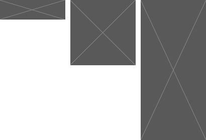
To put this into context, if you were to place the two right-most logos into a conference program listing sponsors, it would appear as if the square logo was a more important sponsor, even if both had paid the same dollar. Someone might be upset. This problem is exacerbated when you only limit a single dimension, as Facebook does with their left-hand profile photos:
To combat this, think about what our eyes are doing when we visually size a field of images to “appear” the same. As an experiment, draw a bunch of random shapes in PowerPoint and then scale them to all appear the same without taking any measurements. What you’ll end up with is something like this:
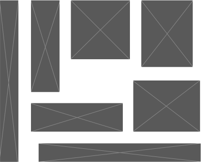
They all seem to be similar in size to the eye, but if you were to draw a square around all of them, then consistently scale those wrappers, you’d lose all of your hard work in getting them to look right.
So, how do I explain what my mind and my eyes are doing for me, so I can program a website to replicate the logic?
Looking at the above exercise, you may draw the same conclusion/theory I drew—that our eye is actually calculating surface area and NOT maximum dimensions, as we might be inclined to implement in our template layout.
To put this theory to work, I ended up writing an algorithm to accept the dimensions of an image I like the size of, as well as the dimensions of an image I want to resize to match. It calculates the area of the image I like, then the area of the image I need to resize. The percentage of area difference is then applied to the dimensions of the image I want to resize, to spit out the new display dimensions. The hardest part was distilling that algorithm down into something concise, but in practice it is actually quite simple.
sqrt(N1*N2)*sqrt(H/W) = H2
- N = each dimension of the base shape
- H & W = original height and width of the image you want to resize
- H2 = your new height dimension
To calculate the new width as well, simply swap the H & W in H/W, or use the equation N2/H2 = W2.
Demo Script
Okay, cool, math…now what? I wrote up a demo script that not only gives you the new dimensions as a calculator and shows a preview of your image sizes, but it also tells you how accurate your new dimensions are (i.e., how many pixels were deleted). See it here:
Strengths and Weaknesses of this Approach
Feel free to use this calculator however you like, but note it has some flaws. There are three primary flaws that come to mind immediately, not affecting most use cases, but weighing on extremities:
- The area algorithm breaks down as images become too extreme. A 6×6 may appear to be the same area as a 9×4 and 4×9, but a 1×36 appears much larger, as it exceeds our focal view. We might draw that shape as a 0.5×18 to start heading back to the comfort level of 2×18 and 3×12, despite it occupying 50% less area. With that in mind, the visual perception of equal size is likely a curve that is flatlined from 1:1 up to 1:4, with a steady and steep curve upward into inaccuracy as the ratio becomes more extreme. That curve would need to be tested and calculated to account for our visual translation of space.
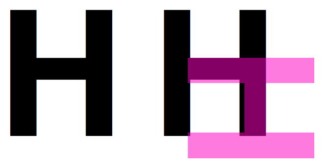
- The eye perceives height differently from width. If you are asked to draw a perfect square, it will most likely be slightly short. Artists combat this by drawing with their paper oriented at a diagonal. In the font family Helvetica, the H demonstrates this, where the bridge has been thinned slightly to account for the vertical stretching of our perception. This is likely due to our use of height to determine distance, within a photograph and the space surrounding us, where we naturally look at something squat and calculate it to be taller/longer that it appears. With that in mind, we’d have to figure out exactly what that ratio of discrepancy is to make our algorithm more precise in matching our eye’s want.
- The last that I can think of is organic shape and other visual hierarchy. We’re discussing comparison of HTML image blocks as equal solids, but more often a logo is text with hollow points and/or composed of a variety of colors, textures, shapes, line weights and more. Darker and more solid logos will appear larger at a smaller size, while something very light and languid will need to be larger to garner visual impact. If you figure out all of that math, let me know. ; )
Setting those aside, this function will get you to the 95% mark more so than your maximum dimension calculator will. This is especially the case in sequential pages like a series of bios or profiles where the logos are not shown side-by-side. Though, even in a field of logos calculated, you should get to something remarkably close to appearing correct, without having to do any manual composition.